The debut EP by Germany’s new blood in eclectic club sounds, Tim Turbo.
The „Hush (Iggy, Iggy)/Linyora EP“ is brimful with tropical bass flavoursas well as state of the art house rhythms featuring a all new multinationaldancefloor phenominon on the vocals consisting of Gnucci Banana
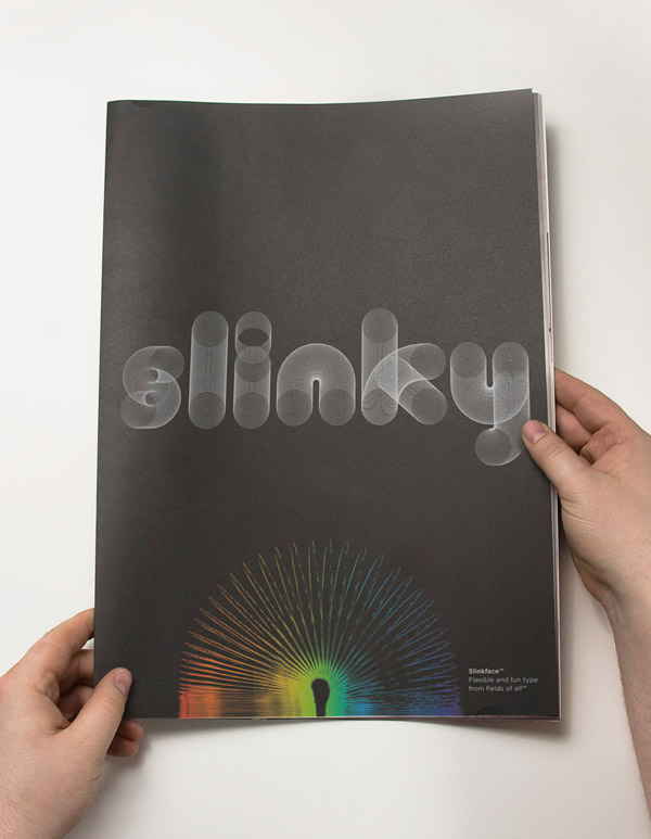
Some interesting and innovative type that is influenced by the iconic child's toy, the slinky. The circular repetition offers a very interesting aesthetic to the typeface. The image-based nature makes it successful in creating some good pieces of design.
The original idea was to create a typeface that is similar to a self-portrait.
Prell is a font that reflects the artist’s personality. The design is cheeky and flirtatious but also conservative and deliberate. The fine curves show a poetic and artful approach whereas the classic proportion of the character is a telltale of constructive thinking.
Representing a transition between artistic creativity and classical geometrical thinking Prell can be used for body text as well as headline logo and poster
Prell come with a vast amount of OTF features Alternates and ligatures check out
Max Miedinger was a Swiss typeface designer. He was famous for creating the Neue Haas Grotesk typeface in 1957 which was renamed Helvetica in 1960. Marketed as a symbol of cutting-edge Swiss technology, Helvetica went global at once.
Between 1926 and 1930 Miedinger trained as a typesetter in Zürich, after which he attended evening classes at the Kunstgewerbeschule in Zürich.
At the age of sixteen Max became an apprentice typesetter at a book printing office for Jacques Bollmann (in Zürich). After four years as an apprentice, Miedinger enrolled in the School of Arts and Crafts. When he was 26 years old, he went to work for an advertising studio called Globe. Here he worked as a typographer and improved his skills. After ten years of working at Globe, Miedinger then gained employment with Haas Type Foundry as a representative. This is where he made his mark on history and designed the most used typeface of the 20th century, Helvetica.
In 1956 Miedinger became a freelance graphic designer and about a year later he collaborated with Edouard Hoffman on the typeface which would later be called Helvetica.


